Multi-platform Unified Design Language
Multi-platform Unified Design Language
This project is dedicated to solving the fragmentation issues common in cross-platform products. In response to pain points such as unclear color definitions, muddled visual hierarchy in dark mode, and repeated component development, we redefined the design guidelines. By establishing a shared language that connects designers and engineers, we not only addressed the technical debt of inconsistent pages, but also brought the product a more intuitive and highly readable visual experience.
ROLE
ROLE
UI / UX Design
UI / UX Design
UI / UX Design
DELIVERABLES
DELIVERABLES
UI Library
Architecture Design
Brand Palette
UI Library
Architecture Design
Brand Palette
Year
Year
2025
2025
2025
PLATFORMS
PLATFORMS
Mac, Windows
Android, iOS
MAC, WINDOWS
Android, iOS
Mac, Windows
Android, iOS

Unified Multi-Platform Design Guidelines
Unified Multi-Platform Design Guidelines
Cross-team Communication Document
Cross-team Communication Document
Boost communication efficiency
Boost communication efficiency
Single source of truth
Single source of truth
Introducing
Introducing
Chaos to Clarity
Chaos to Clarity
Optimizing Delivery Quality
Optimizing Delivery Quality
Letstalk is a cross-platform (Android / iOS / Desktop) encrypted communication tool with a strong focus on privacy. As the product matured, visual inconsistencies across implementations on multiple platforms became a critical issue affecting the user experience. After conducting an in-depth evaluation of design elements across the four platforms, I found clear visual discontinuities in how the underlying design system was implemented on each platform:
Letstalk is a cross-platform (Android / iOS / Desktop) encrypted communication tool with a strong focus on privacy. As the product matured, visual inconsistencies across implementations on multiple platforms became a critical issue affecting the user experience. After conducting an in-depth evaluation of design elements across the four platforms, I found clear visual discontinuities in how the underlying design system was implemented on each platform:
1
Inconsistent color specs
Color code misalignment between design and engineering causes redundant loops and delays.
2
Insufficient dark mode contrast
blurs component boundaries, driving up user error and hurting conversions.
3
Lack of modularity
leads to fragmented UX and low dev velocity, making the product feel unprofessional.
1
Inconsistent color specs
Color code misalignment between design and engineering causes redundant loops and delays.
2
Insufficient dark mode contrast
blurs component boundaries, driving up user error and hurting conversions.
3
Lack of modularity
leads to fragmented UX and low dev velocity, making the product feel unprofessional.
What I Build
What I Build
From Token to System
From Token to System
Cross-Platform Communication Guide
Cross-Platform Communication Guide
Deconstruct & Reassemble
Standardized cross-platform UI kit

Atomic System Overhaul Hardcoding A11y and elevation standards into all core components
By refactoring components with Atomic Design and Design Tokens, we eliminated rework and unified standards across Mac, Web, iOS, and Android. This shift ensured 100% cross-platform consistency and significantly accelerated development velocity.
Reorganization
Standards
Atomic System Overhaul Hardcoding A11y and elevation standards into all core components
By refactoring components with Atomic Design and Design Tokens, we eliminated rework and unified standards across Mac, Web, iOS, and Android. This shift ensured 100% cross-platform consistency and significantly accelerated development velocity.
Benefits
Benefits
From Chaos to System
From Chaos to System
Establishing the Foundation for Cross-Platform Sync
Establishing the Foundation for Cross-Platform Sync
By introducing standardized naming logic, optimizing light and shadow rendering for dark mode, and establishing a systematic core component library, we successfully eliminated the cognitive gap between design and development, greatly improving the accuracy of cross-platform deliverables and collaboration efficiency.
By introducing standardized naming logic, optimizing light and shadow rendering for dark mode, and establishing a systematic core component library, we successfully eliminated the cognitive gap between design and development, greatly improving the accuracy of cross-platform deliverables and collaboration efficiency.
The following are the core value improvements brought to the product by this design system upgrade:
The following are the core value improvements brought to the product by this design system upgrade:

Unified Design Language
Design Tokens unify color naming, bridging the understanding gap and ensuring 100% development fidelity.
Unified Design Language
Design Tokens unify color naming, bridging the understanding gap and ensuring 100% development fidelity.
Unified Design Language
Design Tokens unify color naming, bridging the understanding gap and ensuring 100% development fidelity.

Contrast & Depth Optimization
Fixing flattened UI with high-contrast, accessible styling for optimal multi-environment viewing.
Contrast & Depth Optimization
Fixing flattened UI with high-contrast, accessible styling for optimal multi-environment viewing.
Contrast & Depth Optimization
Fixing flattened UI with high-contrast, accessible styling for optimal multi-environment viewing.

Atomic Library & Scalability
Building atomic cores to reduce 40% of repetitive work, driving faster iterations and seamless cross-platform logic.
Atomic Library & Scalability
Building atomic cores to reduce 40% of repetitive work, driving faster iterations and seamless cross-platform logic.
Atomic Library & Scalability
Build an atomic core component library, reduce repetitive design and development workload by more than 40%, and enable rapid iteration and consistency across cross-platform pages
Deconstructing the System
Deconstructing the System
Systemic Diagnosis
Systemic Diagnosis
Deconstructing and Optimizing the Core System
Deconstructing and Optimizing the Core System
Break Down the Problem
Break Down the Problem
Before formal optimization, we first conducted a comprehensive checkup of the design system to identify the four key issues affecting cross-platform collaboration:
Before formal optimization, we first conducted a comprehensive checkup of the design system to identify the four key issues affecting cross-platform collaboration:
•
Inconsistent color, layout, and sizing across platforms
When users switch from the web to the app and notice a visible mismatch in brand colors, they may instinctively think, "Is this a phishing site?" or "This company's product isn't professional enough." From a business perspective, inconsistent visuals weaken brand recognition and increase users' cognitive load.
# Color
# Page Layout
# Component Structure
•
Inconsistent color, layout, and sizing across platforms
When users switch from the web to the app and notice a visible mismatch in brand colors, they may instinctively think, "Is this a phishing site?" or "This company's product isn't professional enough." From a business perspective, inconsistent visuals weaken brand recognition and increase users' cognitive load.
# Color
# Page Layout
# Component Structure
•
Confusing color naming system
Having different token names means engineers have to check with designers every time they develop a new page to make sure the components match, which causes serious design/development rework. When large-scale color changes are needed in the future (for example, a brand refresh or creating a sub-product), engineers have to search through the code and update it manually one by one. This is highly error-prone and wastes labor costs.
# Token
# Single Source of Truth
# Semantic Naming
# Development Collaboration
•
Confusing color naming system
Having different token names means engineers have to check with designers every time they develop a new page to make sure the components match, which causes serious design/development rework. When large-scale color changes are needed in the future (for example, a brand refresh or creating a sub-product), engineers have to search through the code and update it manually one by one. This is highly error-prone and wastes labor costs.
# Token
# Single Source of Truth
# Semantic Naming
# Development Collaboration
•
Accessibility standards (A11y) not fully met
As the world's population ages, insufficient contrast will affect older users as well as people with visual impairments, color vision deficiencies, and other accessibility needs. In addition, as digital transformation laws become increasingly strict, products that do not meet WCAG standards may face legal action. This is not only an ethical issue, but also a matter of market reach.
# Interactive elements
# A11y
# Accessibility Design
# Regulatory Compliance
•
Accessibility standards (A11y) not fully met
As the world's population ages, insufficient contrast will affect older users as well as people with visual impairments, color vision deficiencies, and other accessibility needs. In addition, as digital transformation laws become increasingly strict, products that do not meet WCAG standards may face legal action. This is not only an ethical issue, but also a matter of market reach.
# Interactive elements
# A11y
# Accessibility Design
# Regulatory Compliance
Specification Organization and Implementation
Specification Organization and Implementation

Semantic color tokens

Font and Spacing Variables

Multilingual Content Variables (i18n)
Semantic Naming
Semantic Naming

Component (Top Level)
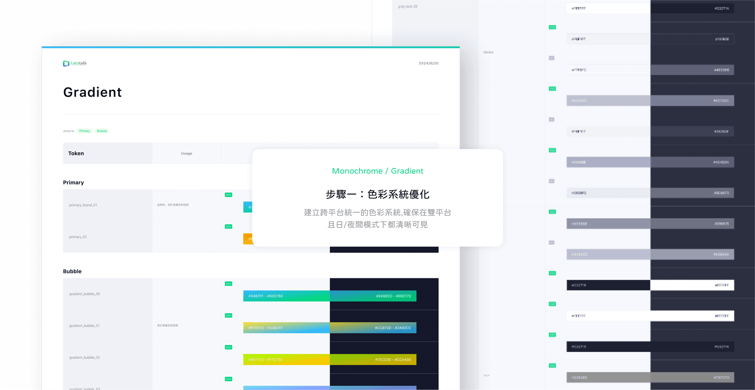
By integrating semantic and PascalCase naming conventions with the development team, a highly scalable color system was successfully established.
Semantic
Link colors to levels to indicate this color code's function
Primitives (Underlying)
Define the base system color palette as the source of the system’s foundational color values.
Color Values
Define the system’s lowest-level Hex Code to ensure all platforms share the same source data.
Component (Top Level)
By integrating semantic and PascalCase naming conventions with the development team, a highly scalable color system was successfully established.
Semantic
Link colors to levels to indicate this color code's function
Primitives (Underlying)
Define the base system color palette as the source of the system’s foundational color values.
Color Values
Define the system’s lowest-level Hex Code to ensure all platforms share the same source data.
Component (Top Level)
By integrating semantic and PascalCase naming conventions with the development team, a highly scalable color system was successfully established.
Semantic
Link colors to levels to indicate this color code's function
Primitives (Underlying)
Define the base system color palette as the source of the system’s foundational color values.
Color Values
Define the system’s lowest-level Hex Code to ensure all platforms share the same source data.
Accessibility Tool
Accessibility Tool

AI-assisted accessibility review and manual review
Use Figma AI tools to perform an initial check for accessibility and specification errors, then have the designer act as the core decision-maker, making the final decision by considering component attributes, visual aesthetics, and usage scenarios.
AI-assisted accessibility review and manual review
Use Figma AI tools to perform an initial check for accessibility and specification errors, then have the designer act as the core decision-maker, making the final decision by considering component attributes, visual aesthetics, and usage scenarios.
AI-assisted accessibility review and manual review
Use Figma AI tools to perform an initial check for accessibility and specification errors, then have the designer act as the core decision-maker, making the final decision by considering component attributes, visual aesthetics, and usage scenarios.
Dark Mode Optimization
Dark Mode Optimization
Adaptive Dark Mode
Adaptive Dark Mode
Consistency and Visual Comfort for Every User Scenario
Consistency and Visual Comfort for Every User Scenario

Break Down the Problem
Break Down the Problem
The original dark mode from the older version had blurry component boundaries and lacked a clearly defined visual hierarchy. When components blended into the background, users felt frustrated. I initially broke these issues down into three major pain points:
The original dark mode from the older version had blurry component boundaries and lacked a clearly defined visual hierarchy. When components blended into the background, users felt frustrated. I initially broke these issues down into three major pain points:
•
Reading discomfort caused by insufficient contrast
When secondary areas blend into the background, users can't quickly scan the page structure. If users have to put in extra effort to read, their eyes can feel dry and tired, which shortens the time they spend on the page and affects product stickiness.
# Nighttime Readability
# Visual Fatigue Optimization
# Height Levels
•
Reading discomfort caused by insufficient contrast
When secondary areas blend into the background, users can't quickly scan the page structure. If users have to put in extra effort to read, their eyes can feel dry and tired, which shortens the time they spend on the page and affects product stickiness.
# Nighttime Readability
# Visual Fatigue Optimization
# Height Levels
•
The disappearing shadow depth and layering
On a dark background, shadows are less noticeable than on a light background, causing all components to appear flat on the same plane and making it harder for users to process information.
# Hierarchy
# Component Shadow
•
The disappearing shadow depth and layering
On a dark background, shadows are less noticeable than on a light background, causing all components to appear flat on the same plane and making it harder for users to process information.
# Hierarchy
# Component Shadow
•
Visual burden on mobile screens
Limited screen space has less room for error. Without a clear hierarchy, key information can get lost in the background.
# Interactive elements
# Mobile Layout
•
Visual burden on mobile screens
Limited screen space has less room for error. Without a clear hierarchy, key information can get lost in the background.
# Interactive elements
# Mobile Layout
Resolution steps
Resolution steps
To address the readability issues in the older dark mode, where components appeared blurry and lacked hierarchy, the new module has been redesigned following Material Design's philosophy of light and shadow. Through precise contrast adjustments and simulated light-source effects, it gives components depth and dimensionality, ensuring mobile users can quickly and accurately interpret actions in complex environments.
To address the readability issues in the older dark mode, where components appeared blurry and lacked hierarchy, the new module has been redesigned following Material Design's philosophy of light and shadow. Through precise contrast adjustments and simulated light-source effects, it gives components depth and dimensionality, ensuring mobile users can quickly and accurately interpret actions in complex environments.
Define Level
Define Level

Elevation Multi-level Definition
Following the Elevation theory of Material Design 2, the depth of components on the Z axis is defined using DP (Density-independent Pixels) values, with components increasing as the Elevation value increases (for example, 2dp, 4dp, 6dp).
Define Light and Dark modes
White-background components use only dark, low-opacity box-shadows. In dark mode, an additional semi-transparent layer is overlaid. The higher the Elevation, the higher the opacity of the white Overlay above the component (for example, 7% → 16%), and the higher-elevation component appears brighter.

Elevation Multi-level Definition
Following the Elevation theory of Material Design 2, the depth of components on the Z axis is defined using DP (Density-independent Pixels) values, with components increasing as the Elevation value increases (for example, 2dp, 4dp, 6dp).
Define Light and Dark modes
White-background components use only dark, low-opacity box-shadows. In dark mode, an additional semi-transparent layer is overlaid. The higher the Elevation, the higher the opacity of the white Overlay above the component (for example, 7% → 16%), and the higher-elevation component appears brighter.
Dark Mode Optimization
Dark Mode Optimization
UI Kit System Setup
UI Kit System Setup
Cross-team collaboration guidelines
Cross-team collaboration guidelines

A single source of truth for cross-team collaboration
A single source of truth for cross-team collaboration
In the new component documentation, we provide a detailed overview from basic components (such as kit elements) to planned feature sets (buttons, color tones, shadow levels), and then integrate and apply them across the main pages.
In the new component documentation, we provide a detailed overview from basic components (such as kit elements) to planned feature sets (buttons, color tones, shadow levels), and then integrate and apply them across the main pages.
By integrating components such as cards, carousels, and modals, we established a set of reusable design patterns. Through an atomic component specification, we ensure that frequently used layouts maintain visual consistency, reduce development communication costs, and eliminate rework in collaborative team workflows.
By integrating components such as cards, carousels, and modals, we established a set of reusable design patterns. Through an atomic component specification, we ensure that frequently used layouts maintain visual consistency, reduce development communication costs, and eliminate rework in collaborative team workflows.
Single Source Of Truth
Single Source Of Truth

Atomic basic components
Define Design Tokens (colors, typography, spacing) and develop reusable foundational atomic components.
Modular Integration of Functions
Combine common components (such as cards, modals, and carousels) into functional units, and establish standardized interaction patterns along with corresponding component usage guidelines.
Page Layout Standardization
Establish general page layout guidelines and responsive design standards, and provide commonly used templates to ensure consistency as complex pages scale.
Atomic basic components
Define Design Tokens (colors, typography, spacing) and develop reusable foundational atomic components.
Modular Integration of Functions
Combine common components (such as cards, modals, and carousels) into functional units, and establish standardized interaction patterns along with corresponding component usage guidelines.
Page Layout Standardization
Establish general page layout guidelines and responsive design standards, and provide commonly used templates to ensure consistency as complex pages scale.
System Evolution
System Evolution
The Evolution of Static Design
The Evolution of Static Design
AI-Powered Generative UI Modules
AI-Powered Generative UI Modules

In an AI-driven design workflow, basic quality control (such as A11y prechecks, color contrast, and click hotspot monitoring) will be handled by AI, freeing designers completely from repetitive inspection work. This allows us to shift our energy from tedious component building to deeper analysis of user pain points, becoming more strategic product designers.
I believe a designer's value will no longer be limited to polished visual layouts, but through understanding the essence of the product, we will think not only about how good it looks, but also about the strong reasons and purpose behind the design.
This project was established in 2025. If you'd like to learn how I integrate design systems with AI Agents, please refer to my latest project:
In an AI-driven design process, basic quality control (such as A11y pre-checks, color contrast, and click hotspot monitoring) will be handled by AI, freeing designers completely from repetitive inspection work. This allows us to shift our energy from tedious component building to deeper analysis of user pain points, becoming more strategic product designers.
I believe a designer's value will no longer be limited to polished visual layouts; instead, through understanding the essence of the product, we will think not only about how good it looks, but about the strong reasons and sense of purpose behind the design.
This project was established in 2025. If you'd like to learn how I further integrated design systems with AI Agents, please refer to my latest project:


COPYRIGHT © CHIEN-YI CHU ALL RIGHTS RESERVED