Designing the Future of AI Data Centers
Designing the Future of AI Data Center
This project documents building Agaruda, a smart factory platform powered by digital twins and data center simulation. Rather than reacting to problems after the fact, we wanted to give managers the tools to anticipate and act before things go wrong. That means understanding not just what the product should do, but who it's really for.
ROLE
Product Strategy
UI / UX Design
Visual Identity
DELIVERABLES
UX Architecture
Brand Identity
Interaction Motion
Exhibition Assets
UX Architecture
Brand Identity
Interaction Motion
Exhibition Assets
Year
2026
PLATFORMS
Omniverse, Mac, Windows


Introducing
Introducing
From 0 to 1 Laying the digital
From 0 to 1 Laying the digital
Experience foundation for the smart factory
Experience foundation for the smart factory
As one of the founding designers of Agaruda, I was responsible for building the complete system for brand identity and product experience from the ground up. Faced with the challenges of an early-stage startup, I deeply integrated a development mindset into the UX process, balancing technical constraints with business goals. For me, design is not just visual presentation; it is about finding balance between technical limitations and business objectives.
Below are my core contributions to the team:
As one of the founding designers of Agaruda, I was responsible for building the entire system of brand identity and product experience from the ground up. Faced with the challenges of an early-stage startup, I deeply integrated product development thinking into the UX process, striking a balance between technical constraints and business goals. For me, design is not just a visual expression, but also something that must balance technical limitations and business objectives.
Below are my core contributions to the team:
Product Planning
Product Planning

Systematic requirements refinement
Used design methodologies to transform fragmented needs into logical workflows. By aligning closely with developers, we mitigated risks and streamlined feature prioritization and technical planning.
Systematic requirements refinement
Used design methodologies to transform fragmented needs into logical workflows. By aligning closely with developers, we mitigated risks and streamlined feature prioritization and technical planning.

Design and development automation integration
Automated Figma → Storybook & GitHub delivery workflow using AI-driven Skill guidelines to standardize components, with version control keeping design assets and teams in real-time sync, cutting communication overhead.
Design and development automation integration
Automated Figma → Storybook & GitHub delivery workflow using AI-driven Skill guidelines to standardize components, with version control keeping design assets and teams in real-time sync, cutting communication overhead.

A development-minded design system
Adopted VisionOS 26 design principles to refactor tokens, ensuring the UI fluidly adapts between 2D information layers and 3D spatial scenes, streamlining handoff and closing a complete end-to-end development loop.
A development-minded design system
Adopted VisionOS 26 design principles to refactor tokens, ensuring the UI fluidly adapts between 2D information layers and 3D spatial scenes, streamlining handoff and closing a complete end-to-end development loop.
Systematic requirements refinement
Used design methodologies to transform fragmented needs into logical workflows. By aligning closely with developers, we mitigated risks and streamlined feature prioritization and technical planning.
A development-minded design system
Adopted VisionOS 26 design principles to refactor tokens, ensuring the UI fluidly adapts between 2D information layers and 3D spatial scenes, streamlining handoff and closing a complete end-to-end development loop.
Design and development automation integration
Automated Figma → Storybook & GitHub delivery workflow using AI-driven Skill guidelines to standardize components, with version control keeping design assets and teams in real-time sync, cutting communication overhead.
Brand Experience
Brand Experience

Primary Product Logo Design
The main product logo is designed based on the CI core visual identity. It uses precise geometric proportions and thoughtfully continues the brand's core visual language and concept.
Primary Product Logo Design
The main product logo is designed based on the CI core visual identity. It uses precise geometric proportions and thoughtfully continues the brand's core visual language and concept.

Product promotional video production
Designed dynamic visuals to make 3D digital twins and AI collaboration logic intuitive, featured live at GTC and Computex as official exhibition videos.
Product promotional video production
Designed dynamic visuals to make 3D digital twins and AI collaboration logic intuitive, featured live at GTC and Computex as official exhibition videos.

Exhibition Visuals and Brand Touchpoints
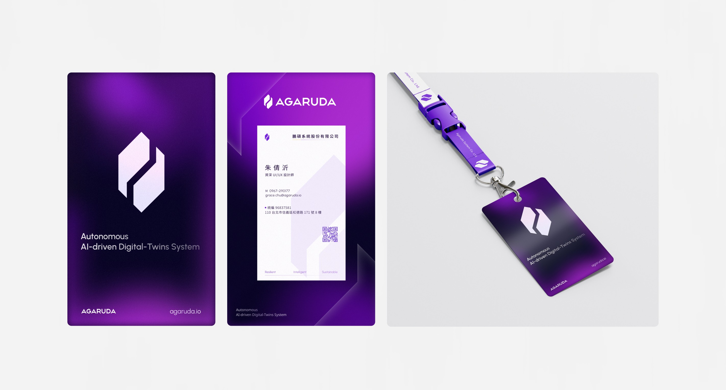
Design work for two major tech exhibitions, Nvidia GTC and Computex. From large retractable banners and exhibition backdrops to business cards and ID badges.
Exhibition Visuals and Brand Touchpoints
Design work for two major tech exhibitions, Nvidia GTC and Computex. From large retractable banners and exhibition backdrops to business cards and ID badges.
Primary Product Logo Design
The main product logo is designed based on the CI core visual identity. It uses precise geometric proportions and thoughtfully continues the brand's core visual language and concept.
Exhibition Visuals and Brand Touchpoints
Design work for two major tech exhibitions, Nvidia GTC and Computex. From large retractable banners and exhibition backdrops to business cards and ID badges.
Product promotional video production
Designed dynamic visuals to make 3D digital twins and AI collaboration logic intuitive, featured live at GTC and Computex as official exhibition videos.
Requirement Definition and Refinement
Requirement Definition and Refinement
Prototype Refinement
Prototype Refinement
Prioritizing information for clarity
Prioritizing information for clarity
In the age of AI, the importance of data security has become increasingly complex compared with the past. For data centers, logging in is not just a simple username and password entry; it also requires attention to the process arrangement of data security.
However, overly complex authentication becomes a barrier for users entering AI tools. To speed up the team’s understanding of the current competitive landscape, I focused on studying how each product balances security and convenience.
Broke down 6 competitors (3 direct, 3 indirect) on the details that actually matter for development, then translated the findings into UX-mapped recommendations the team could act on immediately.
In the age of AI, the importance of data security has become increasingly complex compared with the past. For data centers, logging in is not just a simple username and password entry; it also requires attention to the process arrangement of data security.
However, overly complex authentication becomes a barrier for users entering AI tools. To speed up the team’s understanding of the current competitive landscape, I focused on studying how each product balances security and convenience.
Broke down 6 competitors (3 direct, 3 indirect) on the details that actually matter for development, then translated the findings into UX-mapped recommendations the team could act on immediately.
Screenshots of the relevant pages


Competitive Positioning and UX Analysis
Competitive Positioning and UX Analysis
•
Step 1 - Competitive Analysis Model
Compile information on six competing products (three direct and three indirect competitors), including details on deployment methods, pricing models, implementation processes, login methods, restrictions on multiple users, and official websites. We have also included screenshots of the main interfaces to aid subsequent UI design.
# Competitor Research
# Competitor Audience
# 操作邏輯
•
Step 1 - Competitive Analysis Model
Compile information on six competing products (three direct and three indirect competitors), including details on deployment methods, pricing models, implementation processes, login methods, restrictions on multiple users, and official websites. We have also included screenshots of the main interfaces to aid subsequent UI design.
# Competitor Research
# Competitor Audience
# 操作邏輯
•
Step 2 - Comparison of Competitor Strategies
Transform the raw competitor data into five strategic dimensions (login flow, SSO identification method, login page acquisition funnel, 2FA enforcement level, IdP list, SCIM configuration, multi-device support, new user onboarding method, and login failure notification method), so that the six competitors can be compared side by side, and provide design recommendations appropriate for the current stage, allowing the research findings to be directly used as a basis for the team’s development decisions.
# Side-by-Side Comparison
# Strategy Extraction
•
Step 2 - Comparison of Competitor Strategies
Transform the raw competitor data into five strategic dimensions (login flow, SSO identification method, login page acquisition funnel, 2FA enforcement level, IdP list, SCIM configuration, multi-device support, new user onboarding method, and login failure notification method), so that the six competitors can be compared side by side, and provide design recommendations appropriate for the current stage, allowing the research findings to be directly used as a basis for the team’s development decisions.
# Side-by-Side Comparison
# Strategy Extraction
•
Step 3 - Phase Task Tracking Sheet
A task tracking sheet created for UI/UX design pages, outlining the scenarios that need to be considered. It lists all the screen states that still need to be captured and verified by screenshot (such as the second login step, forgot password flow, 2FA settings page, etc.), and uses red, yellow, and green to indicate priority. Its purpose is to allow research work to be broken up into multiple sessions, so development time won't be blocked by a screen not being captured.
# Scenario Tracking
# Interface Priority
•
Step 3 - Phase Task Tracking Sheet
A task tracking sheet created for UI/UX design pages, outlining the scenarios that need to be considered. It lists all the screen states that still need to be captured and verified by screenshot (such as the second login step, forgot password flow, 2FA settings page, etc.), and uses red, yellow, and green to indicate priority. Its purpose is to allow research work to be broken up into multiple sessions, so development time won't be blocked by a screen not being captured.
# Scenario Tracking
# Interface Priority
•
Step 4 - UX Flow Research Framework
Broke down competitor UX flows (login, SSO, error states, and more) into a structured tracking list, so the next phase of research has a foundation to fill in rather than build from scratch.
# Process Breakdown
# User Journey
# Product Framework
•
Step 4 - UX Flow Research Framework
Broke down competitor UX flows (login, SSO, error states, and more) into a structured tracking list, so the next phase of research has a foundation to fill in rather than build from scratch.
# Process Breakdown
# User Journey
# Product Framework
Use HMW and team brainstorming
Use HMW and team brainstorming
Because the product was still in its early stages, without a clear development focus, and the boundary between NLP capabilities and database integration needs was blurry, each discussion could easily branch out repeatedly from different starting points.
To help the design direction stay more focused, the design team brainstormed together. We used HMW to narrow the problem to questions such as how to help users understand NLP capabilities. We selected the challenges that needed to be solved most, then used Affinity Mapping to synthesize the team's fragmented ideas, structure the requirements, and identify design pain points. Finally, we developed concrete design responses to pain points such as avoiding generation failures and proactively refining prompts.
Simply put, the purpose of choosing HMW was to first converge the problem on the user perspective, ensuring that the subsequent Affinity Mapping and design responses were developed around the right problem, rather than chasing technical feasibility.
Because the product was still in its early stages, without a clear development focus, and the boundary between NLP capabilities and database integration needs was blurry, each discussion could easily branch out repeatedly from different starting points.
To help the design direction stay more focused, the design team brainstormed together. We used HMW to narrow the problem to questions such as how to help users understand NLP capabilities. We selected the challenges that needed to be solved most, then used Affinity Mapping to synthesize the team's fragmented ideas, structure the requirements, and identify design pain points. Finally, we developed concrete design responses to pain points such as avoiding generation failures and proactively refining prompts.
Simply put, the purpose of choosing HMW was to first converge the problem on the user perspective, ensuring that the subsequent Affinity Mapping and design responses were developed around the right problem, rather than chasing technical feasibility.

Define the feature map and interaction logic
Define the feature map and interaction logic
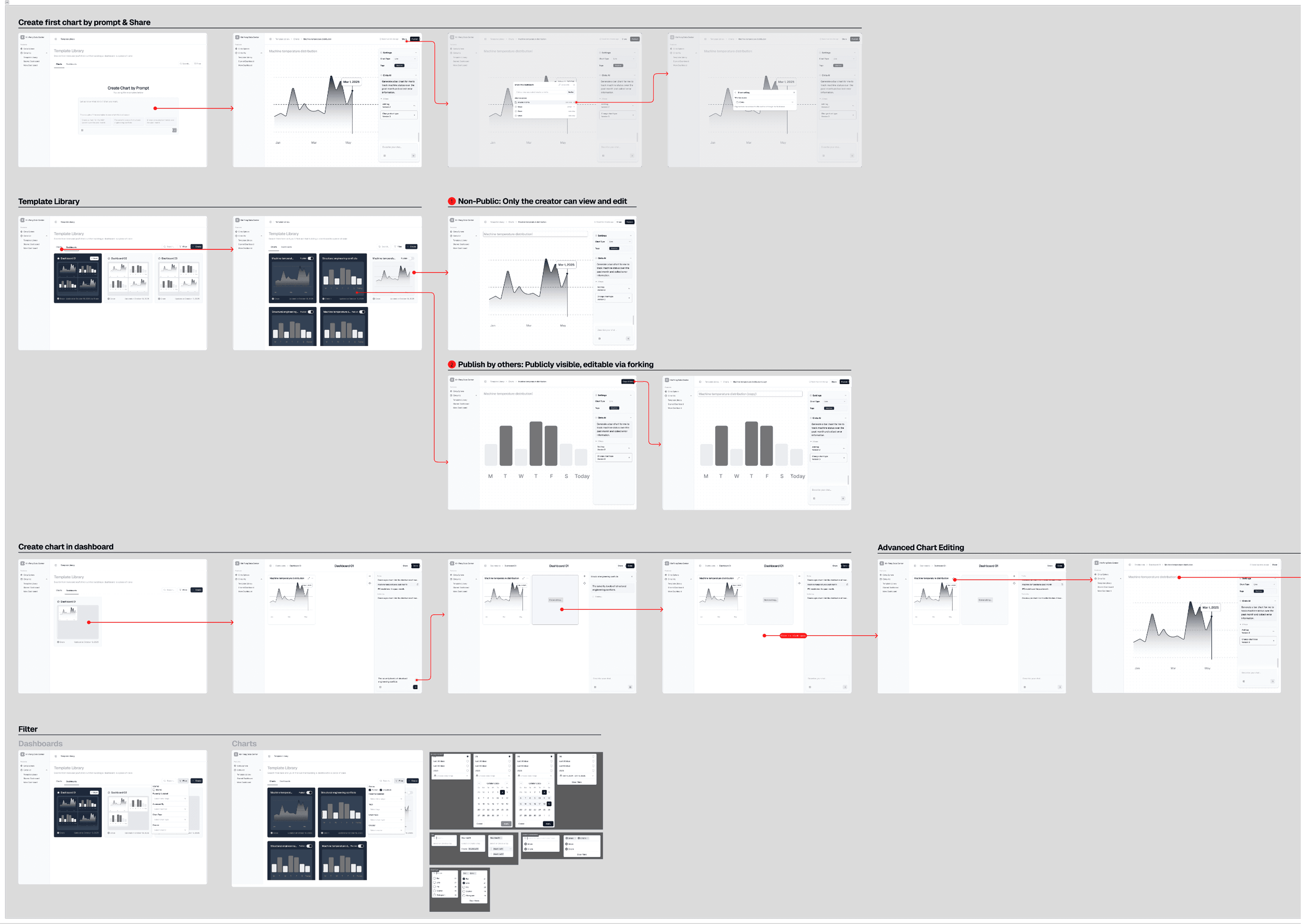
After confirming the product's core direction, we worked further with the development team to transform complex requirements into a concrete logical flow (Flowchart). This diagram initially defined each node in the process, from database integration and AI semantic analysis (NLP) to chart generation and management. By organizing this structure, we could not only anticipate and avoid potential operational conflicts, but also provide both teams with a clear design guide.
After confirming the product's core direction, we worked further with the development team to transform complex requirements into a concrete logical flow (Flowchart). This diagram initially defined each node in the process, from database integration and AI semantic analysis (NLP) to chart generation and management. By organizing this structure, we could not only anticipate and avoid potential operational conflicts, but also provide both teams with a clear design guide.


Quick-focus design
Quick-focus design
After confirming the product's underlying logic and feature flow, we moved into the sketching stage. This step focused on an initial assessment of space layout and interaction cost. Through pen-and-paper sketches, I could quickly brainstorm multiple Dashboard configurations and experiment with interactions between the AI chat window and data charts.
After confirming the product's underlying logic and feature flow, we moved into the sketching stage. This step focused on an initial assessment of space layout and interaction cost. Through pen-and-paper sketches, I could quickly brainstorm multiple Dashboard configurations and experiment with interactions between the AI chat window and data charts.

Low-Fidelity Prototyping and Rapid Validation
Low-Fidelity Prototyping and Rapid Validation
Due to the rapid Sprint approach taken in the early stages of development, we produced a large number of feature prototypes in a very short time. To verify whether these designs aligned with development logic and user intuition, we planned to arrange preliminary user interviews.
Given that the product's early phase involved multiple experimental features and confidential interfaces, and with confidentiality as the priority, we decided to conduct internal interviews. This allowed us to make real-time adjustments to the feature architecture and user flows before the visual direction was finalized. In addition to enabling designers to confirm whether the core logic was feasible before investing in visual planning, it also ensured that the design and development teams were fully aligned on information.
Internal interviews in the product's early phase greatly reduced the risk of information leakage and also saved the company a great deal of time and cost in finding external test participants during the resource-constrained startup period.
Due to the rapid Sprint approach taken in the early stages of development, we produced a large number of feature prototypes in a very short time. To verify whether these designs aligned with development logic and user intuition, we planned to arrange preliminary user interviews.
Given that the product's early phase involved multiple experimental features and confidential interfaces, and with confidentiality as the priority, we decided to conduct internal interviews. This allowed us to make real-time adjustments to the feature architecture and user flows before the visual direction was finalized. In addition to enabling designers to confirm whether the core logic was feasible before investing in visual planning, it also ensured that the design and development teams were fully aligned on information.
Internal interviews in the product's early phase greatly reduced the risk of information leakage and also saved the company a great deal of time and cost in finding external test participants during the resource-constrained startup period.

Before
After
Before
After
Interview Materials Preparation
Interview Materials Preparation
Before the official interview, we prepared three documents:
Before the official interview, we prepared three documents:
•
Non-Disclosure Agreement (NDA)
In addition to ensuring that assets such as unreleased prototype designs and core AI logic do not leak, in order to prevent competitors from imitating them, we also state that we place the utmost importance on the privacy and data rights of interviewees.
•
Non-Disclosure Agreement (NDA)
In addition to ensuring that assets such as unreleased prototype designs and core AI logic do not leak, in order to prevent competitors from imitating them, we also state that we place the utmost importance on the privacy and data rights of interviewees.
•
Interview Outline and Process
To ensure consistency in interview data and to focus on the product’s core issues, we developed an interview process to make sure every interviewee follows the same 기준, allowing us to compare the interview results.
•
Interview Outline and Process
To ensure consistency in interview data and to focus on the product’s core issues, we developed an interview process to make sure every interviewee follows the same 기준, allowing us to compare the interview results.
•
Phase Task Planning
Given that the product has many features and is fairly complex, we chose a task-based testing strategy to design the process around core functions. This way, we can make sure every page can be reviewed and accepted, while also clearly seeing whether participants feel confused at each key step.
•
Phase Task Planning
Given that the product has many features and is fairly complex, we chose a task-based testing strategy to design the process around core functions. This way, we can make sure every page can be reviewed and accepted, while also clearly seeing whether participants feel confused at each key step.


Interview Data Analysis
Interview Data Analysis
In this interview, I recorded through Teams and combined it with Notion AI real-time transcription, which helped me focus on observing the interviewee's emotions and reactions.
After the interview, I cross-checked the video with the AI text to ensure the accuracy of the information and filter out noise. Finally, I integrated the fragmented information into user journey map and systematic insight table, condensing the original 50-minute audio-visual material into visual charts that can be absorbed in 5 minutes, clearly highlighting the pain points at each stage and users' anticipated mindset in the process, effectively accelerating decision-making efficiency in cross-department communication.
In this interview, I recorded through Teams and combined it with Notion AI real-time transcription, which helped me focus on observing the interviewee's emotions and reactions.
After the interview, I cross-checked the video with the AI text to ensure the accuracy of the information and filter out noise. Finally, I integrated the fragmented information into user journey map and systematic insight table, condensing the original 50-minute audio-visual material into visual charts that can be absorbed in 5 minutes, clearly highlighting the pain points at each stage and users' anticipated mindset in the process, effectively accelerating decision-making efficiency in cross-department communication.
Interview Process


Turning Data Into Visual Charts


Before

After
Before
After
Pain Point Consolidation and Priority Determination
Pain Point Consolidation and Priority Determination
After the interviews, in addition to visualizing the information, I created a priority matrix. The goal was to help the development and design teams quickly decide what should be done first.
After the interviews, in addition to visualizing the information, I created a priority matrix. The goal was to help the development and design teams quickly decide what should be done first.

Core Pain Point (L)
Flag any functional blockers that interrupt tasks or seriously frustrate users.
Consensus Convergence (red sticky note)
Highlight the pain points commonly encountered by different interviewees (User A/B), as these are usually the top-priority starting points for a product redesign.
Hierarchical Classification
Using this model, I quantify feedback into three levels: "core pain points," "missing features," and "interface improvements," helping the team make accurate, faster decisions.
Core Pain Point (L)
Flag any functional blockers that interrupt tasks or seriously frustrate users.
Consensus Convergence (red sticky note)
Highlight the pain points commonly encountered by different interviewees (User A/B), as these are usually the top-priority starting points for a product redesign.
Hierarchical Classification
Using this model, I quantify feedback into three levels: "core pain points," "missing features," and "interface improvements," helping the team make accurate, faster decisions.
Exploratory Research
Brand Foundations
Brand Foundations
Defining identity and design systems
Defining identity & design systems
Once the functional interface was confirmed, we began defining the product's main visual direction.
In the initial product visual positioning, we did not simply pursue visual aesthetics; we also gave deep consideration to the integration of the system architecture and the implementation efficiency of front-end development. We chose to first reference mature design specifications on the market (Design Tokens) as the foundational architecture for subsequent system development, ensuring that everything from color and spacing to component states (States) could achieve a high degree of consistency in a 3D simulation environment, thereby significantly reducing communication costs for backend development and the gap in visual fidelity.
Once the functional interface was confirmed, we began defining the product's main visual direction.
In the initial product visual positioning, we did not simply pursue visual aesthetics; we also gave deep consideration to the integration of the system architecture and the implementation efficiency of front-end development. We chose to first reference mature design specifications on the market (Design Tokens) as the foundational architecture for subsequent system development, ensuring that everything from color and spacing to component states (States) could achieve a high degree of consistency in a 3D simulation environment, thereby significantly reducing communication costs for backend development and the gap in visual fidelity.
Research Before Design Positioning
Research Before Design Positioning
Agaruda's primary interaction area is within the 3D scenes of NVIDIA Omniverse. To maintain an intuitive workflow without obscuring complex digital assets, we define the UI as no longer a superficial 2D layer, but as constituent elements within three-dimensional space. Unlike the flat dimensions of traditional B2B products, 3D scenes are highly dynamic environments with frequent changes, placing extreme demands on the readability of information arranged in the interface.
To that end, we have summarized the following core design pain points:
Agaruda's primary interaction area is within the 3D scenes of NVIDIA Omniverse. To maintain an intuitive workflow without obscuring complex digital assets, we define the UI as no longer a superficial 2D layer, but as constituent elements within three-dimensional space. Unlike the flat dimensions of traditional B2B products, 3D scenes are highly dynamic environments with frequent changes, placing extreme demands on the readability of information arranged in the interface.
To that end, we have summarized the following core design pain points:
•
Visual Noise and Information Shielding
Traditional flat-design UI can "disappear" or create intense visual competition against complex backgrounds. How can we ensure a clear sense of boundaries for an operations panel without obscuring key 3D assets behind it, such as device components or path simulations?
# Visual Load
# Spatial Layering
# Background Blur
•
Visual Noise and Information Shielding
Traditional flat-design UI can "disappear" or create intense visual competition against complex backgrounds. How can we ensure a clear sense of boundaries for an operations panel without obscuring key 3D assets behind it, such as device components or path simulations?
# Visual Load
# Spatial Layering
# Background Blur
•
Color and Contrast Distortion in Dynamic Environments
A UI that lacks physical depth makes it hard for users to tell whether components are in front of, behind, or inside assets. How can shadow, perspective, and Z-axis displacement be used to establish a clear spatial hierarchy?
# Dynamic Contrast
# Depth Perception
#Parallax System
# Light Source Adaptation
•
Color and Contrast Distortion in Dynamic Environments
A UI that lacks physical depth makes it hard for users to tell whether components are in front of, behind, or inside assets. How can shadow, perspective, and Z-axis displacement be used to establish a clear spatial hierarchy?
# Dynamic Contrast
# Depth Perception
#Parallax System
# Light Source Adaptation
•
Development fidelity and rendering performance
Complex CSS filters, if not optimized, can cause 3D scenes to lag. How can we translate VisionOS's visual sensibility into efficient design tokens, so front-end developers can preserve design details while maintaining 60 FPS?
# Design Guidelines
# Development Consistency
# Performance Metrics
•
Development fidelity and rendering performance
Complex CSS filters, if not optimized, can cause 3D scenes to lag. How can we translate VisionOS’s visual sensibility into efficient design tokens, so front-end developers can preserve design details while maintaining 60 FPS?
# Design Guidelines
# Development Consistency
# Performance Metrics
Define interface: Transition from 2D to 3D scene
Define interface: Transition from 2D to 3D scene
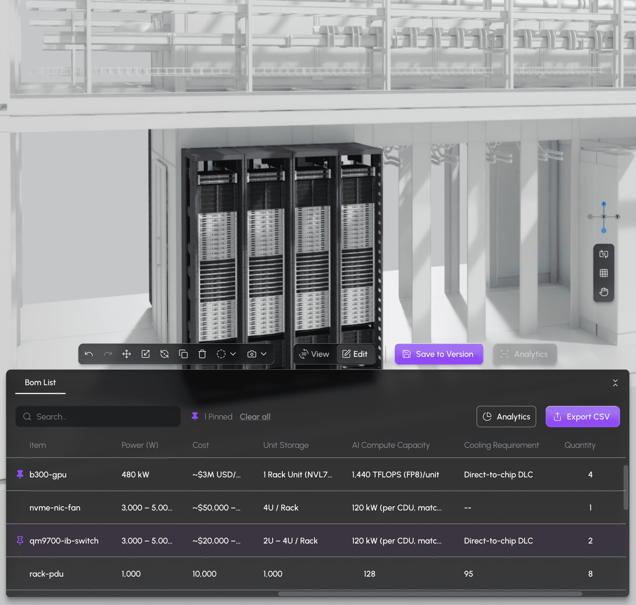
We drew inspiration from the core idea of "coexisting with reality," defined by VisionOS 26 for immersive environments. Through Fluid Glass and Deep Radius design, we overcame the challenge of information legibility in 3D dynamic backgrounds.
At the same time, to ensure the design could be smoothly collaborated on and implemented with the development team, we further integrated the data architecture of Untitled UI and Shadcn. Through a systematic engineering language, we organized the design system with mature Design Token specifications, improving implementation fidelity in development collaboration and accelerating product iteration efficiency.
We drew inspiration from the core idea of "coexisting with reality," defined by VisionOS 26 for immersive environments. Through Fluid Glass and Deep Radius design, we overcame the challenge of information legibility in 3D dynamic backgrounds.
At the same time, to ensure the design could be smoothly collaborated on and implemented with the development team, we further integrated the data architecture of Untitled UI and Shadcn. Through a systematic engineering language, we organized the design system with mature Design Token specifications, improving implementation fidelity in development collaboration and accelerating product iteration efficiency.

Legibility Strategies for Immersion
Legibility Strategies for Immersion
We chose VisionOS 26 not simply for its trendy frosted-glass aesthetic, but to study how it handles "the occlusion relationship between digital objects and the physical environment". In Omniverse's high-dynamic background, traditional UI can lead to severe visual fatigue. By studying VisionOS, we extracted the logic of light-and-shadow filtering and depth-of-field layering, ensuring that when the UI floats above 3D assets, it can maintain a natural, unobtrusive presence rather than a clumsy overlay.
We chose VisionOS 26 not simply for its trendy frosted-glass aesthetic, but to study how it handles "the occlusion relationship between digital objects and the physical environment". In Omniverse's high-dynamic background, traditional UI can lead to severe visual fatigue. By studying VisionOS, we extracted the logic of light-and-shadow filtering and depth-of-field layering, ensuring that when the UI floats above 3D assets, it can maintain a natural, unobtrusive presence rather than a clumsy overlay.
1
Visual Noise Reduction
3D scenes are full of intricate lines (grids, component edges). Fluid glass can act like a filter, "softening" background noise so the text and data in front stand out from the complex environment, preserving information contrast.
2
Context-aware
Fluid Glass allows users to faintly see the 3D assets behind it. This is very important in the Omniverse environment because users need to view UI parameters while also monitoring the spatial position of the assets behind them to ensure operations are accurate.
3
Dynamic Adaptability
Fluid Glass changes its tone as the light and shadows of the scene behind it shift (for example, when moving from a bright outdoor space into a deep mountain tunnel). This kind of "color symbiosis" reduces the UI's visual abruptness and makes the interface feel lighter.
1
Visual Noise Reduction
3D scenes are full of intricate lines (grids, component edges). Fluid glass can act like a filter, "softening" background noise so the text and data in front stand out from the complex environment, preserving information contrast.
2
Context-aware
Fluid Glass allows users to faintly see the 3D assets behind it. This is very important in the Omniverse environment because users need to view UI parameters while also monitoring the spatial position of the assets behind them to ensure operations are accurate.
3
Dynamic Adaptability
Fluid Glass changes its tone as the light and shadows of the scene behind it shift (for example, when moving from a bright outdoor space into a deep mountain tunnel). This kind of "color symbiosis" reduces the UI's visual abruptness and makes the interface feel lighter.
1
Visual Noise Reduction
3D scenes are full of intricate lines (grids, component edges). Fluid glass can act like a filter, "softening" background noise so the text and data in front stand out from the complex environment, preserving information contrast.
3
Dynamic Adaptability
Fluid Glass changes its tone as the light and shadows of the scene behind it shift (for example, when moving from a bright outdoor space into a deep mountain tunnel). This kind of "color symbiosis" reduces the UI's visual abruptness and makes the interface feel lighter.
2
Context-aware
Fluid Glass allows users to faintly see the 3D assets behind it. This is very important in the Omniverse environment because users need to view UI parameters while also monitoring the spatial position of the assets behind them to ensure operations are accurate.
Distinguishing Between Interfaces and 3D Assets
Distinguishing Between Interfaces and 3D Assets
In 3D industrial simulation scenes, there are many right angles and rigid structures. We deliberately use large-radius chamfers to create a visual distinction between non-natural/non-structural elements. This helps the user's brain quickly distinguish which elements are 3D assets in the scene and which are clickable operation windows, greatly reducing cognitive load.
In 3D industrial simulation scenes, there are many right angles and rigid structures. We deliberately use large-radius chamfers to create a visual distinction between non-natural/non-structural elements. This helps the user's brain quickly distinguish which elements are 3D assets in the scene and which are clickable operation windows, greatly reducing cognitive load.
1
Focus effect
According to visual psychology, rounded corners can guide the eye inward toward the center, helping users more quickly spot key data in information-dense dashboards.
2
Difference Between Square and Rounded Corners
In 3D space, objects with right angles are usually rigid architectural structures or boundaries, while soft, large bevels can give floating objects a distinctive look. This helps users quickly distinguish between what is part of the fixed 3D scene and what is an interactive floating window.
1
Focus effect
According to visual psychology, rounded corners can guide the eye inward toward the center, helping users more quickly spot key data in information-dense dashboards.
2
Difference Between Square and Rounded Corners
In 3D space, objects with right angles are usually rigid architectural structures or boundaries, while soft, large bevels can give floating objects a distinctive look. This helps users quickly distinguish between what is part of the fixed 3D scene and what is an interactive floating window.
1
Focus effect
According to visual psychology, rounded corners can guide the eye inward toward the center, helping users more quickly spot key data in information-dense dashboards.
2
Difference Between Square and Rounded Corners
In 3D space, objects with right angles are usually rigid architectural structures or boundaries, while soft, large bevels can give floating objects a distinctive look. This helps users quickly distinguish between what is part of the fixed 3D scene and what is an interactive floating window.
Foundations Of Architecture
Foundations Of Architecture
Implementation
Implementation
Integrating UI with 3D environments
Integrating UI with 3D environments

Component Hierarchy Management
Component Hierarchy Management
After establishing the product’s visual direction in the early stage, we began building the design system. For Agaruda, where usage scenarios rely heavily on 3D simulation, the interface should not be a sticker pasted over the scene, but part of the environment. I defined the interaction principles for a four-layer vertical architecture . To allow 2D data to float in front of 3D assets in a natural, lightweight way, I decomposed the interface into four layers with different physical attributes, from the environmental awareness of the bottom layer to the shadow visual weight of the top layer. Through this vertical architecture planning, I preserved the VisionOS visual style while integrating M3's elevation-based hierarchy management.
After establishing the product’s visual direction in the early stage, we began building the design system. For Agaruda, where usage scenarios rely heavily on 3D simulation, the interface should not be a sticker pasted over the scene, but part of the environment. I defined the interaction principles for a four-layer vertical architecture . To allow 2D data to float in front of 3D assets in a natural, lightweight way, I decomposed the interface into four layers with different physical attributes, from the environmental awareness of the bottom layer to the shadow visual weight of the top layer. Through this vertical architecture planning, I preserved the VisionOS visual style while integrating M3's elevation-based hierarchy management.


•
Layer 1 & 2: Building Atmosphere and Identity
At the bottom layer, we used semi-transparent frosted glass. The purpose of this layer is to "coexist with reality," allowing users, while interacting, to still slightly see the position of the 3D assets behind it. Next, we added VisionOS-style fluid bevels. This is not only for visual appeal, but also to create visual anchors with rounded contours in hardware-heavy industrial settings, helping users quickly recognize that this is an interface they can interact with.
# Spatial Hierarchy
# Frosted Glass Material
•
Layer 1 & 2: Building Atmosphere and Identity
At the bottom layer, we used semi-transparent frosted glass. The purpose of this layer is to "coexist with reality," allowing users, while interacting, to still slightly see the position of the 3D assets behind it. Next, we added VisionOS-style fluid bevels. This is not only for visual appeal, but also to create visual anchors with rounded contours in hardware-heavy industrial settings, helping users quickly recognize that this is an interface they can interact with.
# Spatial Hierarchy
# Frosted Glass Material
•
Layer 3: Addressing readability pain points
The middle layer, Inner Blur, is a key design element of the component. Like a filter, it simulates glass refraction to soften background noise. This solves the problem in 3D scenes where complex background assets make text hard to read, ensuring strong contrast for the information.
# Optical Refraction
# Visual Noise Reduction
# Dynamic Contrast
•
Layer 3: Addressing readability pain points
The middle layer, Inner Blur, is a key design element of the component. Like a filter, it simulates glass refraction to soften background noise. This solves the problem in 3D scenes where complex background assets make text hard to read, ensuring strong contrast for the information.
# Optical Refraction
# Visual Noise Reduction
# Dynamic Contrast
•
Layer 4: Define component priority
At the highest level of handling, I referred to Material Design 3's Elevation logic. In 3D space, users need to clearly know which window is closer to them. I converted M3's elevation into Z-axis values in space, so the depth of the shadows directly reflects the urgency of the information. The development team only needs to use the corresponding Elevation Token to fully present this physically grounded sense of depth in the software they develop.
# M3 Elevation System
# Visual Weight
# Physical-Level Cognition
•
Layer 4: Define component priority
At the highest level of handling, I referred to Material Design 3's Elevation logic. In 3D space, users need to clearly know which window is closer to them. I converted M3's elevation into Z-axis values in space, so the depth of the shadows directly reflects the urgency of the information. The development team only needs to use the corresponding Elevation Token to fully present this physically grounded sense of depth in the software they develop.
# M3 Elevation System
# Visual Weight
# Physical-Level Cognition
Height and Depth Level Definitions

M3 Altitude

Inner Blur

Liquid Glass
Implementing Dark Mode
Implementing Dark Mode
Multi-Scenario Simulation
System Adaptation
Dynamic visual balance in dark mode
Dynamic visual balance in dark mode

Practical Application
Practical Application
When designing dark mode for 3D scenes, dark mode is not simply a color inversion. To maintain information accuracy in low-light scenes, we need to consider that when the contrast between text and background is too high, haloing, chromatic dispersion, and visual stimulation can occur. This can cause an uncomfortable feeling of the text wobbling and being glaring when there is too much content. The shadows and sense of depth of light mode are actually not very effective in dark mode, and in usage scenarios, users might use the product in extreme environments such as dimly lit factories or bright outdoor settings.
Based on the above considerations, I referred to the latest Material Design specifications, used M3's elevation system to adjust the shadow levels, and introduced VisionOS's liquid glass boundaries to strengthen outline recognition, maintaining visual balance between the 3D model and the UI interaction layer.
When designing dark mode for 3D scenes, dark mode is not simply a color inversion. To maintain information accuracy in low-light scenes, we need to consider that when the contrast between text and background is too high, haloing, chromatic dispersion, and visual stimulation can occur. This can cause an uncomfortable feeling of the text wobbling and being glaring when there is too much content. The shadows and sense of depth of light mode are actually not very effective in dark mode, and in usage scenarios, users might use the product in extreme environments such as dimly lit factories or bright outdoor settings.
Based on the above considerations, I referred to the latest Material Design specifications, used M3's elevation system to adjust the shadow levels, and introduced VisionOS's liquid glass boundaries to strengthen outline recognition, maintaining visual balance between the 3D model and the UI interaction layer.
•
Material 3 container color semantics
In the M3 system, Container colors specifically define the background color of a component (such as Primary Container), while On-Container defines the foreground content paired with it (such as On Primary Container). This pairing ensures stable legibility and visual balance for colors at any elevation.
This time, I followed the recommendations of the new M3 and replaced the highly saturated Primary color from M2 with Primary Container. This allows floating components to blend into the 3D space in a softer, more modern way, reducing visual fatigue during extended use.
•
Material 3 container color semantics
In the M3 system, Container colors specifically define the background color of a component (such as Primary Container), while On-Container defines the foreground content paired with it (such as On Primary Container). This pairing ensures stable legibility and visual balance for colors at any elevation.
This time, I followed the recommendations of the new M3 and replaced the highly saturated Primary color from M2 with Primary Container. This allows floating components to blend into the 3D space in a softer, more modern way, reducing visual fatigue during extended use.

Color is hierarchy
The new M3 system replaces M2 component shadow levels with different "surface tone" levels and uses brighter colors and icon color schemes.
Color is hierarchy
The new M3 system replaces M2 component shadow levels with different "surface tone" levels and uses brighter colors and icon color schemes.
Establish Guidelines
Establish Guidelines

M3 Altitude

Semantic Naming

Merged into the Skill specification
Color Scales and Token Creation
Color Scales and Token Creation
Scaling specs into a production-grade engine
Scaling specs into a production-grade engine

With the help of AI, Living Design System is no longer a static design document, but a system that continuously "grows" as the product evolves, technology is updated, and user needs change. By using AI Skill as a bridge, the development team can train this digital asset together with designers, allowing the standards to automatically align and calibrate with every code generation and design iteration. This helps bridge the gap between design and development and ensures that all cross-functional participants can access the latest design system documentation. The following are the key elements I believe:
With the help of AI, Living Design System is no longer a static design document, but a system that continuously "grows" as the product evolves, technology is updated, and user needs change. By using AI Skill as a bridge, the development team can train this digital asset together with designers, allowing the standards to automatically align and calibrate with every code generation and design iteration. This helps bridge the gap between design and development and ensures that all cross-functional participants can access the latest design system documentation. The following are the key elements I believe:
Key Elements
Key Elements
•
Automated Specification Alignment
Any changes made by designers in Figma (such as adjusting tokens or component styles) can be compiled into update details with AI assistance, submitted as a report to developers, and then iteratively updated after developers review and confirm the content.
•
Automated Specification Alignment
Any changes made by designers in Figma (such as adjusting tokens or component styles) can be compiled into update details with AI assistance, submitted as a report to developers, and then iteratively updated after developers review and confirm the content.
•
Living Doc Co-creation and Maintenance
The content maintained by designers is no longer a "text description," but a set of prompt instructions. Developers and designers will jointly maintain the component's "conditional definitions" and "interaction logic." Designers have AI compile the latest GitHub commits and Figma changes, and then confirm whether they comply with brand specifications and UI-related guidelines. The final result is organized into AI Skill documentation, which the entire team uses as the latest design standards.
•
Living Doc Co-creation and Maintenance
The content maintained by designers is no longer a "text description," but a set of prompt instructions. Developers and designers will jointly maintain the component's "conditional definitions" and "interaction logic." Designers have AI compile the latest GitHub commits and Figma changes, and then confirm whether they comply with brand specifications and UI-related guidelines. The final result is organized into AI Skill documentation, which the entire team uses as the latest design standards.
•
Ongoing maintenance through multi-party collaboration
When the development team is implementing components and creates new elements not covered by the existing UI kit, AI can help detect and proactively label them as "non-standard components." It can also instantly compile implementation feedback from the development team and the differences from the design files, helping the team decide whether to "standardize" this component into the system or keep it as an exception.
•
Ongoing maintenance through multi-party collaboration
When the development team is implementing components and creates new elements not covered by the existing UI kit, AI can help detect and proactively label them as "non-standard components." It can also instantly compile implementation feedback from the development team and the differences from the design files, helping the team decide whether to "standardize" this component into the system or keep it as an exception.
To help AI better and more efficiently understand the design system, I built a complete UI Kit design specification covering interaction details from foundational tokens to complex components. To address the communication gap between design and development, I carefully defined each component's usage scenarios and interaction standards.
Next, I used Claude Code to organize these design specifications into a "AI Skill," transforming static guidelines into digital assets with "design logic" so the system can automatically generate code that complies with brand standards. This turned it into a tool for accelerating communication with the development team and eliminating the cognitive gap between design and development. I believe this new AI skill allows designers to focus their energy on solving user experience problems rather than early-stage pixel tweaking. Here is my process:
To help AI better and more efficiently understand the design system, I built a complete UI Kit design specification covering interaction details from foundational tokens to complex components. To address the communication gap between design and development, I carefully defined each component's usage scenarios and interaction standards.
Next, I used Claude Code to organize these design specifications into a "AI Skill," transforming static guidelines into digital assets with "design logic" so the system can automatically generate code that complies with brand standards. This turned it into a tool for accelerating communication with the development team and eliminating the cognitive gap between design and development. I believe this new AI skill allows designers to focus their energy on solving user experience problems rather than early-stage pixel tweaking. Here is my process:
Set up base component settings
Set up base component settings
In the latest design workflow, Figma has shifted roles to become the source of the product's foundational brand colors and design guidelines. For the guidelines I established, I reused the naming approach from the previous project, using a scalable semantic naming architecture. To address internationalization needs, I specifically referenced the i18n typography guidelines already built into the official website, handling the impact of text length across languages on UI layout. At the same time, to enable Claude Code to read Figma and integrate it into Storybook more efficiently, all tokens use the same PascalCase naming convention as the development team, reducing development costs between design and code.
In the latest design workflow, Figma has shifted roles to become the source of the product's foundational brand colors and design guidelines. For the guidelines I established, I reused the naming approach from the previous project, using a scalable semantic naming architecture. To address internationalization needs, I specifically referenced the i18n typography guidelines already built into the official website, handling the impact of text length across languages on UI layout. At the same time, to enable Claude Code to read Figma and integrate it into Storybook more efficiently, all tokens use the same PascalCase naming convention as the development team, reducing development costs between design and code.

Semantic color tokens

Font and Spacing Variables

Multilingual Content Variables (i18n)
Semantic Naming

Component (Top Level)
By integrating semantic and PascalCase naming conventions with the development team, a highly scalable color system was successfully established.
Semantic
Link colors to levels to indicate this color code's function
Primitives (Underlying)
Define the base system color palette as the source of the system's foundational color values.
Color Values
Define the system's lowest-level Hex Code to ensure all platforms share the same source data.
Component (Top Level)
By integrating semantic and PascalCase naming conventions with the development team, a highly scalable color system was successfully established.
Semantic
Link colors to levels to indicate this color code's function
Primitives (Underlying)
Define the base system color palette as the source of the system's foundational color values.
Color Values
Define the system's lowest-level Hex Code to ensure all platforms share the same source data.
Component Anatomy
Component Anatomy

Anatomy of Visualization Components
To deepen the alignment between design and engineering, I referred to the uSpec standard and created an Anatomy (diagram) illustration for the core components in the system.
Anatomy of Visualization Components
To deepen the alignment between design and engineering, I referred to the uSpec standard and created an Anatomy (diagram) illustration for the core components in the system.
Design System Specification Document (Claude Skill)
Design System Specification Document (Claude Skill)
While building the design system, we had already clearly discussed the color and layout guidelines for the first version, at this point we began building the Claude Skill documentation. This can reduce the development time designers spend when creating new components. Before organizing the Skills, we first needed to clarify how a Skill works, its purpose is to allow Claude, in future conversations, to avoid re-deriving known design decisions. So there is only one standard for organizing them:
▍When Claude receives a task, can it get sufficiently precise guidelines, require the least amount of reading, and directly produce the correct code?
To ensure the AI can read the information accurately and that this information can remain highly scalable in the future, I had Claude read the design system and then extract the colors, typography, spacing, glass effects, layouts, and interaction specifications into separate Foundation Skills, serving as the project-wide source of foundational values. The detailed process is as follows:
While building the design system, we had already clearly discussed the color and layout guidelines for the first version, at this point we began building the Claude Skill documentation. This can reduce the development time designers spend when creating new components. Before organizing the Skills, we first needed to clarify how a Skill works, its purpose is to allow Claude, in future conversations, to avoid re-deriving known design decisions. So there is only one standard for organizing them:
▍When Claude receives a task, can it get sufficiently precise guidelines, require the least amount of reading, and directly produce the correct code?
To ensure the AI can read the information accurately and that this information can remain highly scalable in the future, I had Claude read the design system and then extract the colors, typography, spacing, glass effects, layouts, and interaction specifications into separate Foundation Skills, serving as the project-wide source of foundational values. The detailed process is as follows:
Before organizing the Skills, first clarify how a Skill works; its essence is to allow Claude to avoid re-deriving known design decisions in future conversations. So there is only one criterion for organizing them:
▎ When Claude receives a task, can it use the fewest possible reads to get sufficiently precise specifications and directly produce the correct code?
To ensure the AI can read the data precisely and that this data remains highly extensible in the future, I had Claude read the design system and extract colors, typography, spacing, glass effects, layouts, and interaction specifications into separate Foundation Skills, serving as the source of baseline values for the entire project. The detailed process is as follows :

Single source of truth
At the top is Figma's design system. Please have the AI Agent flow downward through extraction into six Foundation Skills (color, typography, spacing, glass, layout, interaction). This layer is the single source of truth for the entire system; values are defined only once here.
Atomic Design Layers
The middle layer is made up of Component Skills organized according to atomic design. Each component declares its dependencies internally, references the corresponding Foundation as needed, and avoids repeatedly hardcoding any numeric values.
Trigger Scenario Example
The three trigger paths reflect actual design workflows: when building components, the system starts from the Component entry and references the Foundation as needed. For Token lookups or layout creation, it accesses the Foundation layer directly. This decoupled approach minimizes Token consumption, accelerates response times, and ensures high precision.
Single source of truth
At the top is Figma's design system. Please have the AI Agent flow downward through extraction into six Foundation Skills (color, typography, spacing, glass, layout, interaction). This layer is the single source of truth for the entire system; values are defined only once here.
Atomic Design Layers
The middle layer is made up of Component Skills organized according to atomic design. Each component declares its dependencies internally, references the corresponding Foundation as needed, and avoids repeatedly hardcoding any numeric values.
Trigger Scenario Example
The three trigger paths reflect actual design workflows: when building components, the system starts from the Component entry and references the Foundation as needed. For Token lookups or layout creation, it accesses the Foundation layer directly. This decoupled approach minimizes Token consumption, accelerates response times, and ensures high precision.
Integration of Design and Development
Integration of Design and Development
Automated Workflow
Automated Workflows
Linking components to dev-docs
Linking components to dev-docs

From a Single Project to a Systematic Ecosystem
From a Single Project to a Systematic Ecosystem
For this AI integration, we built a highly scalable design system. It transformed the project from a single resource into the team's shared infrastructure, so that in the future, no matter which team or new project it is, they can directly adapt and use it. At the same time, I also deployed Storybook and GitHub for version control to accelerate development time for the subsequent AI workflow.
By standardizing the base components, designers are finally free from repetitive visual organization. We can now focus more on deciding what should be done and what should not be done, putting our energy into improving the product's core value.
For this AI integration, we built a highly scalable design system. It transformed the project from a single resource into the team's shared infrastructure, so that in the future, no matter which team or new project it is, they can directly adapt and use it. At the same time, I also deployed Storybook and GitHub for version control to accelerate development time for the subsequent AI workflow.
By standardizing the base components, designers are finally free from repetitive visual organization. We can now focus more on deciding what should be done and what should not be done, putting our energy into improving the product's core value.
For this AI integration, we built a highly scalable design system. It transformed the project from a single resource into the team's shared infrastructure, so that in the future, no matter which team or new project it is, they can directly adapt and use it. At the same time, I also deployed Storybook and GitHub for version control to accelerate development time for the subsequent AI workflow.
By standardizing the base components, designers are finally free from repetitive visual整理. We can now focus more on deciding what should be done and what should not be done, putting our energy into improving the product's core value.
Design Assets
Design Assets

Design System Basics

Skill Standards

Storybook component preview
Component Integration Storybook
Component Integration Storybook
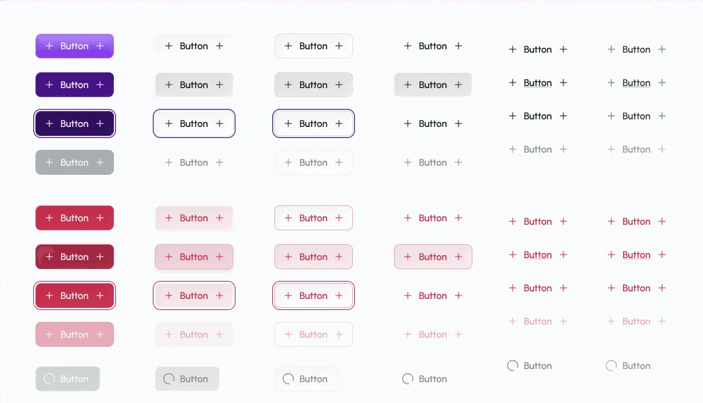


AI-Driven Design System Process
AI-Driven Design System
After several rounds of refining the Skill guidelines, I started exploring ways to integrate third-party MCP tools (such as Pencil, Cursor, Lovable, etc.) for reference and diagrams. In the end, I chose Pencil as my primary tool, paired it with Figma to build a complete design system, used Storybook for review, and pushed everything to GitHub for version tracking so future collaborators can reliably access the latest designs. Here is my workflow:
After several rounds of refining the Skill guidelines, I started exploring ways to integrate third-party MCP tools (such as Pencil, Cursor, Lovable, etc.) for reference and diagrams. In the end, I chose Pencil as my primary tool, paired it with Figma to build a complete design system, used Storybook for review, and pushed everything to GitHub for version tracking so future collaborators can reliably access the latest designs. Here is my workflow:
From Concept To Development
From Concept To Development

Marketing Collateral
Marketing Collateral
Event Visuals
Event Visuals
NVIDIA GTC & Computex International
NVIDIA GTC & Computex International
In addition to product design, I was also involved in the creation of the main product logo, promotional videos for international exhibitions (NVIDIA GTC & Computex 2026), and visual marketing materials for exhibition stands, thereby extending the brand's visual identity across both online and offline platforms.
In addition to product design, I was also involved in the creation of the main product logo, promotional videos for international exhibitions (NVIDIA GTC & Computex 2026), and visual marketing materials for exhibition stands, thereby extending the brand's visual identity across both online and offline platforms.
Cinta Logo Design
Cinta Logo Design


Exhibition Promotional Material
Exhibition Promotional Material

Business Cards
Exhibition Badge

Roll-up Banner
GTC & Computex Related Videos
GTC & Computex Related Videos


COPYRIGHT © CHIEN-YI CHU ALL RIGHTS RESERVED